Chartwork
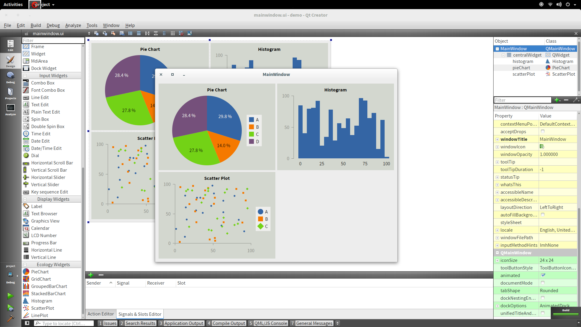
Chart Widgets for Qt
Chart Widgets for Qt


Chartwork runs on Ubuntu 14.04 (64 bit) and requires Qt 5.
Double-click the .deb file to open the Software Center.
Click ›Install‹ and enter your password.
Chartwork runs on Windows 7 and newer and requires at least Qt 5.4.
Qt 5 Chartwork 1.1.0 (32 bit) Chartwork 1.1.0 (64 bit)
Download and install the free version of Visual Studio, Visual Studio Community.
Visual Studio is required to build apps with Chartwork in Qt Creator.
Download the open-source version of Qt 5 and Chartwork.
If you are running 32-bit Windows, install the 32-bit versions of Qt 5 and Chartwork. On 64-bit Windows, install the 64-bit versions instead.
Install Qt 5.
Run the Chartwork installer.
Click ›Open Qt Directory‹ and select the location where you installed Qt 5 (e. g., C:\Qt).
Click ›Install‹.
[...]\qtcreator.exe -noload Welcome.
Chartwork runs on Mac OS X 10.7 (Lion) and newer and requires Qt 5.4.
Install Xcode from the App Store.
Xcode ships a compiler that can be used with Qt Creator.
Download the open-source version of Qt 5 and Chartwork.
Install Qt 5.
Run the Chartwork installer.
Click ›Open Qt Directory‹ and select the location where you installed Qt 5 (e. g., /Users/user/Qt5.4.1).
Click ›Install‹.
You can now start Qt Creator from the Qt directory.
For instructions on how to build Chartwork from sources, see the readme on GitHub.
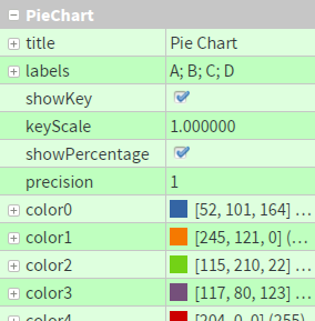
setTitle(QString)
setLabels(QStringList)
setShowKey(bool)
setKeyScale(double)
setShowPercentage(bool)
setPrecision(int)
setColor0(QColor)
setColor1(QColor)
setColor2(QColor)
...
To change the number of slices, click on the option labels.
In the pop-up menu, you can add or remove slices and change their labels.
By removing the checkmark next to showKey, you can hide the key.
Instead, you can also reduce the dimensions of the key with keyScale.
You can change the number of decimal places of the percentages with the precision option.
By removing the checkmark next to showPercentage, you can hide the percentages.

At the bottom of the options panel, you can change the color palette (via the options color0 to color7).
color0 will be used for the first slice, and so forth.
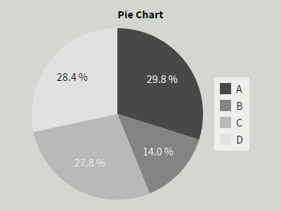
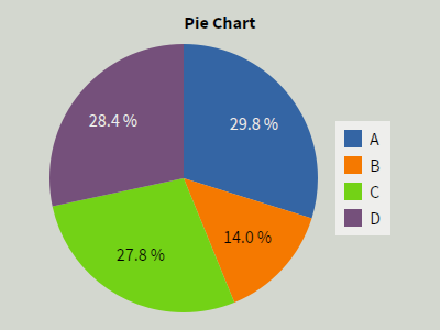
To resize the slice labeled as ›C‹ to a value of 35, just write:
ui->pieChart->setValue("C", 35.0);
Alternatively, you can address slices by their index, starting with 0. In our example, ›C‹ has index 2, and thus you can write:
ui->pieChart->setValue(2, 35.0);
You can also set the values of all slices simultaneously, e. g., to 100:
ui->pieChart->setAllValues(100.0);
Reading the size of a slice in the pie chart is similar to writing it—you can address it either by its label (›C‹) or its index (2):
double value1 = ui->pieChart->value("C");
	double value2 = ui->pieChart->value(2);
ui->myChart->update().
Else, your changes won’t be visible immediately.
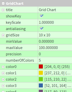
setTitle(QString)
setShowKey(bool)
setKeyScale(double)
setAntialiasing(bool)
setGridSize(QSize)
setMinValue(double)
setMaxValue(double)
setPrecision(int)
setNumberOfColors(int)
setColor0(QColor)
setColor1(QColor)
setColor2(QColor)
...
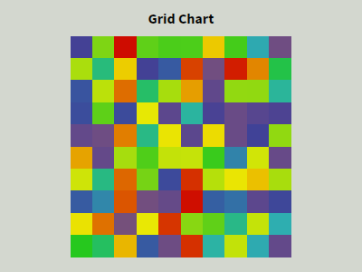
To change the number of columns or rows, click on the plus symbol next to gridSize.
The options Width and Height determine the grid resolution.

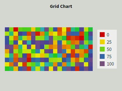
The minimum and maximum values determine the range of values that will be mapped to the color palette.
Cells with the value minValue will be displayed with the first color color0, the value maxValue will be shown having the last color and in-between values will be blended between the colors in the color palette.
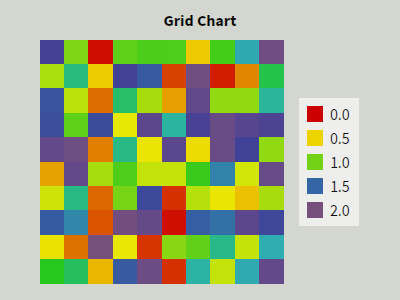
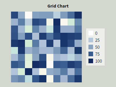
You can change the number of decimal places in the key with the precision option.
By removing the checkmark next to showKey, you can hide the key.
Instead, you can also reduce the dimensions of the key with keyScale.
If you need more or less than 5 color steps, adjust the numberOfColors option.
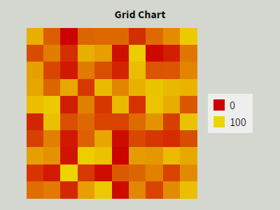
At the bottom of the options panel, you can change the color palette (via the options color0 to color7).
color0 will be used for the first step, and so forth.
To set the value of cell [5, 10] to 75, write:
ui->gridChart->setValue(5, 10, 75.0);
You can also set the values of all cells simultaneously, e. g., to 0:
ui->gridChart->setAllValues(0.0);
Reading the value of a cell is similar to writing it:
double value = ui->gridChart->value(5, 10);
ui->myChart->update().
Else, your changes won’t be visible immediately.
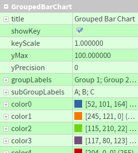
setTitle(QString)
setShowKey(bool)
setKeyScale(double)
setYMax(double)
setYPrecision(int)
setGroupLabels(QStringList)
setSubGroupLabels(QStringList)
setColor0(QColor)
setColor1(QColor)
setColor2(QColor)
...
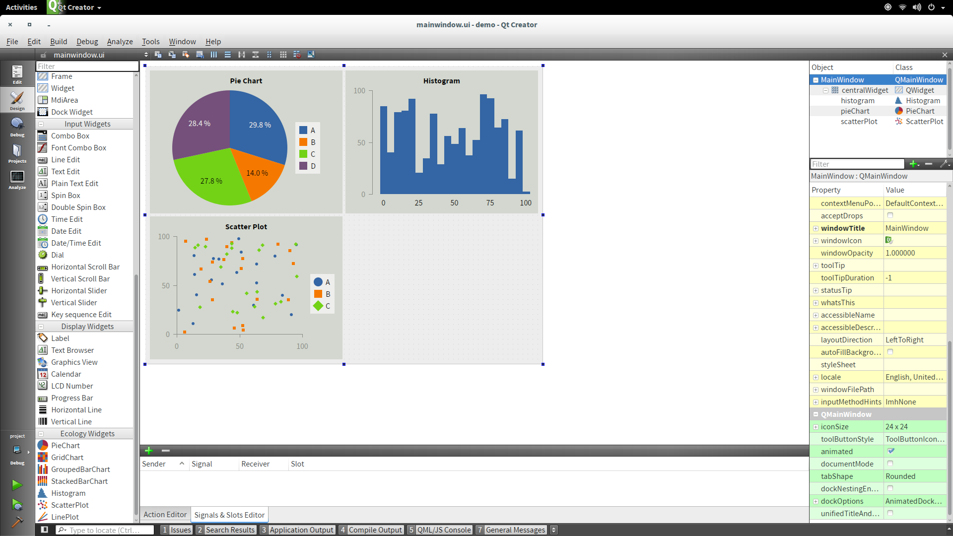
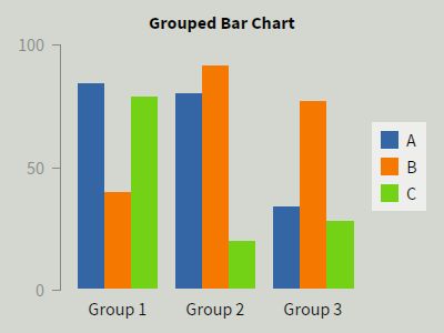
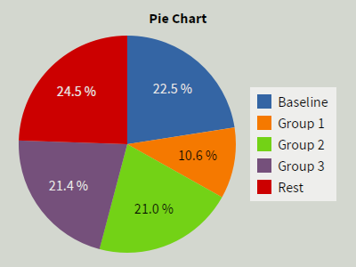
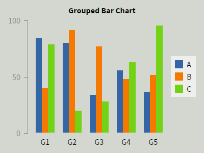
Grouped bar charts display bars in different groups.
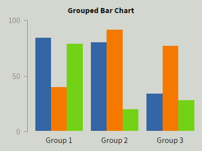
The option groupLabels defines how many groups will be displayed (see screenshot in the middle below).
By clicking on this option, a pop-up menu will show up in which you can add, remove, and rename groups.
In addition, you can configure the number of bars per group with the option subGroupLabels (see the right screenshot).
In analogy to groups, you can add, remove, and rename them.


You can modify the maximum value of the scale with yMax (the minimum is always 0).
The precision of the scale can be changed with yPrecision.
By removing the checkmark next to showKey, you can hide the key.
Instead, you can also reduce the dimensions of the key with keyScale.
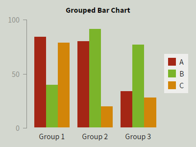
At the bottom of the options panel, you can change the color palette (via the options color0 to color7).
color0 will be used for the first bar in each group, and so forth.
To resize the bar labeled as ›C‹ in group ›Group 1‹ to a value of 15, just write:
ui->groupedBarChart->setValue("Group 1", "C", 15.0);
Alternatively, you can address groups and subgroups by their index, starting with 0. In our example, ›Group 1‹ has index 0 and ›C‹ has index 2, and thus you can write:
ui->groupedBarChart->setValue(0, 2, 15.0);
You can also set the values of all bars simultaneously, e. g., to 100:
ui->groupedBarChart->setAllValues(100.0);
Reading the size of a bar in the bar chart is similar to writing it—you can address it either by labels (›Group 1‹, ›C‹) or indices (0, 2):
double value1 = ui->groupedBarChart->value("Group 1", "C");
	double value2 = ui->groupedBarChart->value(0, 2);
ui->myChart->update().
Else, your changes won’t be visible immediately.
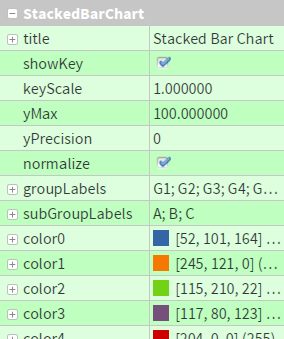
setTitle(QString)
setShowKey(bool)
setKeyScale(double)
setYMax(double)
setYPrecision(int)
setNormalize(bool)
setGroupLabels(QStringList)
setSubGroupLabels(QStringList)
setColor0(QColor)
setColor1(QColor)
setColor2(QColor)
...
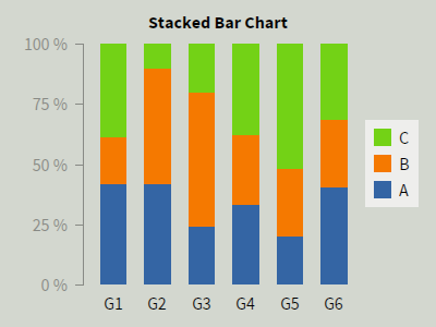
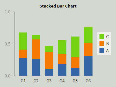
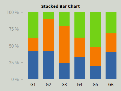
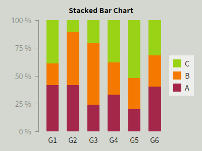
Stacked bar charts display several bars with stacked subgroups.
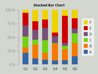
The option groupLabels defines how many bars will be displayed (see screenshot in the middle below).
By clicking on this option, a pop-up menu will show up in which you can add, remove, and rename bars.
In addition, you can configure the number of stacked parts per bar with the option subGroupLabels (see the right screenshot).
In analogy to bars, you can add, remove, and rename them.

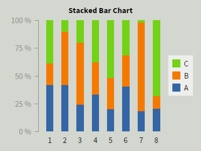
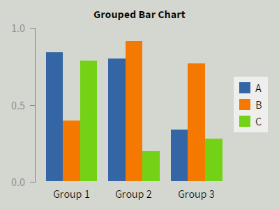
By default, data in stacked bar charts are normalized to 100 %. You can disable this behavior by removing the checkmark next to normalize.
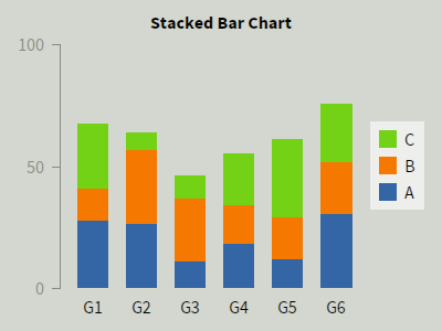
When normalize is disabled, you can modify the maximum value of the scale with yMax (the minimum is always 0).
The precision of the scale can be changed with yPrecision.
normalize.
By removing the checkmark next to showKey, you can hide the key.
Instead, you can also reduce the dimensions of the key with keyScale.
At the bottom of the options panel, you can change the color palette (via the options color0 to color7).
color0 will be used for the first part in each bar, and so forth.
To resize the part labeled as ›C‹ in bar ›G1‹ to a value of 65, just write:
ui->stackedBarChart->setValue("G1", "C", 65.0);
Alternatively, you can address bars and parts by their index, starting with 0. In our example, ›G1‹ has index 0 and ›C‹ has index 2, and thus you can write:
ui->stackedBarChart->setValue(0, 2, 65.0);
You can also set the values of all parts simultaneously, e. g., to 100:
ui->stackedBarChart->setAllValues(100.0);
Reading the size of a part in the bar chart is similar to writing it—you can address it either by labels (›G1‹, ›C‹) or indices (0, 2):
double value1 = ui->stackedBarChart->value("G1", "C");
	double value2 = ui->stackedBarChart->value(0, 2);
ui->myChart->update().
Else, your changes won’t be visible immediately.
setTitle(QString)
setShowKey(bool)
setKeyScale(double)
setXMin(double)
setXMax(double)
setXStep(double)
setXPrecision(int)
setYMax(double)
setYPrecision(int)
setColor(QColor)
...
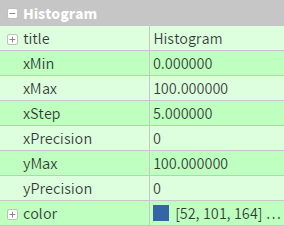
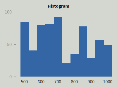
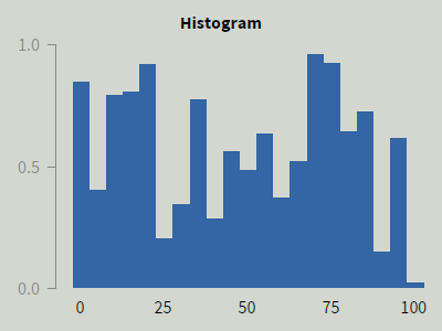
Histograms display bars for a range of values, specified by the options xMin, xMax, and xStep.
For instance, you can reproduce the right screenshot if you choose the range 500 to 1000 and steps of 50.
Furthermore, you can change the number of decimal places in the bar labels with xPrecision.
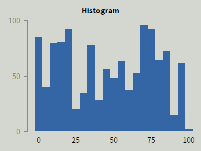
You can modify the maximum value of the y scale with yMax (the minimum is always 0).
The precision of the scale can be changed with yPrecision.
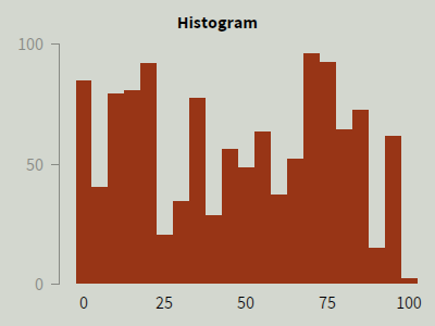
You can change the color of the histogram via the option color.
To resize the 3rd bar in the histogram to 40, write:
ui->histogram->setValue(2, 40.0);
You can also set the values of all parts simultaneously, e. g., to 100:
ui->histogram->setAllValues(100.0);
Reading the size of a bar in the histogram is similar to writing it:
double value = ui->histogram->value(2);
ui->myChart->update().
Else, your changes won’t be visible immediately.
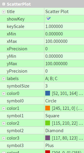
setTitle(QString)
setShowKey(bool)
setKeyScale(double)
setXMin(double)
setXMax(double)
setXPrecision(int)
setYMin(double)
setYMax(double)
setYPrecision(int)
setLabels(QStringList)
setSymbolSize(int)
setColor0(QColor)
setSymbol0(Symbol::Type)
setColor1(QColor)
setSymbol1(Symbol::Type)
setColor2(QColor)
setSymbol2(Symbol::Type)
...
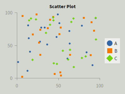
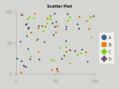
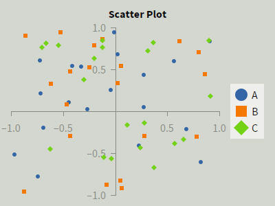
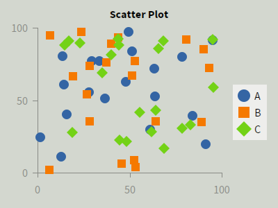
Scatter Plots can display different data series using different colors and symbols.
To add or remove data series, click on the option labels and modify the entries in the pop-up window that shows up.

You can choose minimum and maximum values for both axes using xMin, xMax, yMin, and yMax, respectively.
The precision of the scales can be changed with xPrecision and yPrecision.
By removing the checkmark next to showKey, you can hide the key.
Instead, you can also reduce the dimensions of the key with keyScale.
At the bottom of the options panel, you can change the symbols and the color palette (via the options color0 to color7 and symbol0 to symbol7). color0 and symbol0 will be used for the first data series, and so forth.
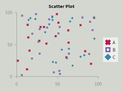
| Circle |  |
CircleOutline |  |
| Square |  |
SquareOutline |  |
| Diamond |  |
DiamondOutline |  |
| Plus |  |
Cross |  |
With the option symbolSize, you can increase or decrease the size of the symbols.
To add the data point [5, 20] to your data series ›Baseline‹, just write:
ui->scatterPlot->addData("Baseline", 5.0, 20.0);
Alternatively, you can address data series by their index, starting with 0. In our example, ›Baseline‹ has index 0, and thus you can write:
ui->scatterPlot->addData(0, 5.0, 20.0);
To clear the whole data series ›Baseline‹, write one of the following:
ui->scatterPlot->clearData("Baseline");
	ui->scatterPlot->clearData(0);
You can also clear all data series of your plot simultaneously:
ui->scatterPlot->clearAllData();
ui->myChart->update().
Else, your changes won’t be visible immediately.
setTitle(QString)
setShowKey(bool)
setKeyScale(double)
setXMin(double)
setXMax(double)
setXPrecision(int)
setYMin(double)
setYMax(double)
setYPrecision(int)
setLabels(QStringList)
setLineWidth(double)
setColor0(QColor)
setColor1(QColor)
setColor2(QColor)
...
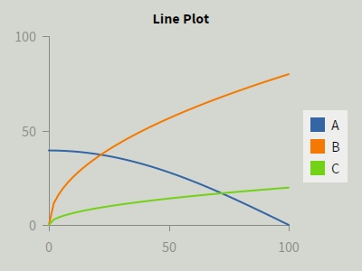
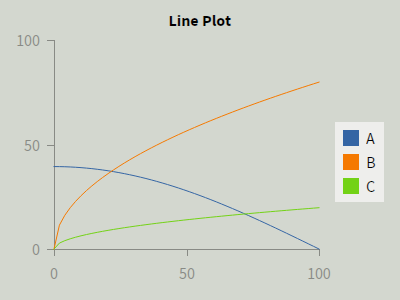
Line Plots can display different data series using differently colored lines.
To add or remove data series, click on the option labels and modify the entries in the pop-up window that shows up.
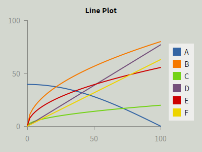
You can choose minimum and maximum values for both axes using xMin, xMax, yMin, and yMax, respectively.
The precision of the scales can be changed with xPrecision and yPrecision.
By removing the checkmark next to showKey, you can hide the key.
Instead, you can also reduce the dimensions of the key with keyScale.
At the bottom of the options panel, you can change the color palette (via the options color0 to color7). color0 will be used for the first data series, and so forth.
With the option lineWidth you can increase or decrease the width of the lines.
To add the data point [5, 20] to your data series ›Baseline‹, just write:
ui->linePlot->addData("Baseline", 5.0, 20.0);
Alternatively, you can address data series by their index, starting with 0. In our example, ›Baseline‹ has index 0, and thus you can write:
ui->linePlot->addData(0, 5.0, 20.0);
To clear the whole data series ›Baseline‹, write one of the following:
ui->linePlot->clearData("Baseline");
	ui->linePlot->clearData(0);
You can also clear all data series of your plot simultaneously:
ui->linePlot->clearAllData();
ui->myChart->update().
Else, your changes won’t be visible immediately.
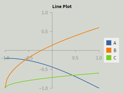
Assume you have set up a scatter plot ranging from −1 to +1 both in x and y. If you add a data point at [50, 50], it will obviously not be painted.
If you don’t see your data, first make sure you configured the charts to use the same value range your own code uses.
If you still don’t see any changes in your application, you might have forgotten to call the update() method after setting your data in the chart. If you don’t call update(), the chart will not be painted.
Do it like this:
for (int x = 0; x < 20; x++)
	for (int y = 0; y < 20; y++)
		ui->gridChart->setValue(x, y, myValue);

ui->gridChart->update();
for loops, call update() once at the end (like shown above) to improve performance.
If you call functions with invalid values, you might get an error message. The following explains the sources of these errors and how to fix them.
[Error] Access to ScatterPlot 'scatterPlot' at dataSeries = 5 is out of range.
        Allowed values are dataSeries = 0...2 here.
In this example, the programmer has tried to write a value in the 6th data series in his scatter plot. However, he has created only 3, causing an out-of-range error.
[Error] Cannot access labels of LinePlot 'linePlot', because it is empty.
This error means that you tried to access a value in a chart, but it has no data series, groups, subgroups, etc. yet.
[Error] Access to LinePlot 'linePlot' at label = 'Baseline' is invalid.
        Allowed values for label are here:
        * A
        * B
        * C
This error means that you tried to access a group, subgroup, pie slice, or data series in a chart which does not exist.
The source code is hosted at GitHub.
Feel free to build new features and fix bugs by creating a pull request. You are also welcome to report any issues and feature suggestions.
Copyright (c) 2015 Patrick Lühne and Christoph Sterz
Permission is hereby granted, free of charge, to any person obtaining a copy of this software and associated documentation files (the "Software"), to deal in the Software without restriction, including without limitation the rights to use, copy, modify, merge, publish, distribute, sublicense, and/or sell copies of the Software, and to permit persons to whom the Software is furnished to do so, subject to the following conditions:
The above copyright notice and this permission notice shall be included in all copies or substantial portions of the Software.
THE SOFTWARE IS PROVIDED "AS IS", WITHOUT WARRANTY OF ANY KIND, EXPRESS OR IMPLIED, INCLUDING BUT NOT LIMITED TO THE WARRANTIES OF MERCHANTABILITY, FITNESS FOR A PARTICULAR PURPOSE AND NONINFRINGEMENT. IN NO EVENT SHALL THE AUTHORS OR COPYRIGHT HOLDERS BE LIABLE FOR ANY CLAIM, DAMAGES OR OTHER LIABILITY, WHETHER IN AN ACTION OF CONTRACT, TORT OR OTHERWISE, ARISING FROM, OUT OF OR IN CONNECTION WITH THE SOFTWARE OR THE USE OR OTHER DEALINGS IN THE SOFTWARE.